Behind the Scenes: Belladonna Cove | Episode 6.4
 |
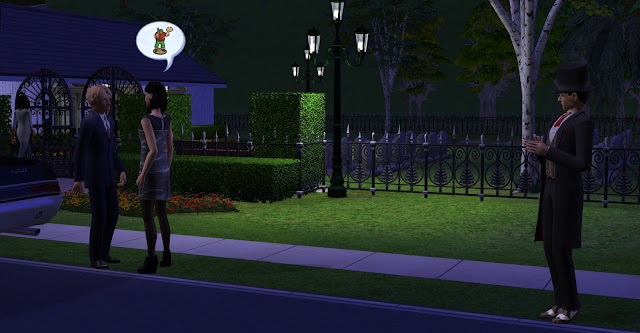
| Kimberly chatting about her vacation to Armand ... |
After I finished editing this episode and then began the uploading process, I decided to play around with the thumbnails for this series. See, I feel that the current thumbnails don't stick out. Here's what I did:
First attempt. I wanted to focus on the main character, so I decided to cut Kimberly and then make the background black and white. For a moment, I wanted this to be the thumbnail, with no episode number and so on.
But then I decided to add the Sims 2 logo so that a potential viewer will immediately know which Sims game this is. I did consider leaving the logo in colour, but I wanted the eye to immediately snap to one thing - Kimberly and her reaction. I felt that leaving the logo in colour would give the thumbnail two focal points. Also, I'm not sure about the size of the logo.
After adding the logo, I decided to add some extra colour to Kimberly's outline, and I decided on green because of the Sims. Green plumbob, happy plumbob. I did want the outline to be a bit bigger, because like this, you can't really see the green outline, especially if you're scrolling through YouTube - the thumbnail can be pretty small. So, maybe I'll try to make the outline a little bigger. I did experiment with the outline earlier, but I didn't like the bigger version. I want it, oh yes I do, but on the other hand, I feel it may be a bit too much.
This was the final version. I decided to play with the contrast setting for the background, so now the blacks are darker. But it may be a bit too dark. (So, I decided to use the pre-contrast version.) For example, look at the thumbnail that I made for episode 6.3:
I increased the contrast and it made the textures in the background pop. There's a lot of detail and I like it. I wasn't sure if changing the contrast for episode 6.4's thumbnail was the right choice - I think if you would see the preview for the episode on your phone or tablet, then the background would probably be too dark, so that's why I went with version 3 in the end. But on the other hand, Kimberly is the focus. We should look at her.
And then, about episode 6.3, I did consider making the background black and white. The plan is to slowly change all the thumbnails - if I feel the new ones are better. But right now, I don't want every thumbnail to be mostly black and white. But on the other hand, it will group all the episodes together, like you immediately know that this video belongs to the Belladonna Cove series. So, I want the black and white background because of consistency, but I'm not sure about it right now. But I'm also not sure about changing the background to red - eventually, there will be so many different colours. Will it be too busy? Black and white here, red there, orange here, blue there, and so on.
I'm not sure, but eventually I'll be able to make a decision.


Comments
Post a Comment